Clients ←

Functional and effective financing can make a difference in the success of a small or medium business.
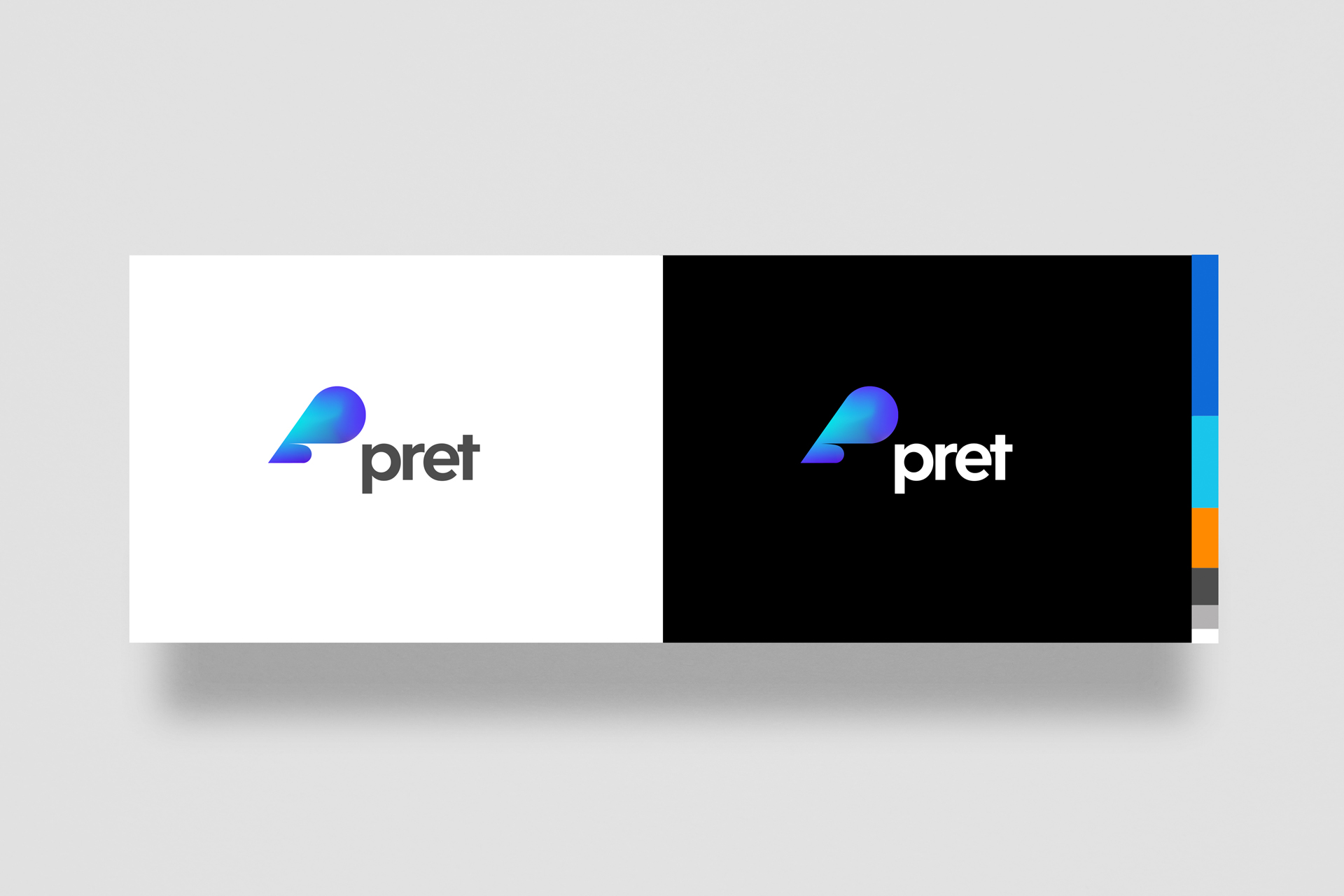
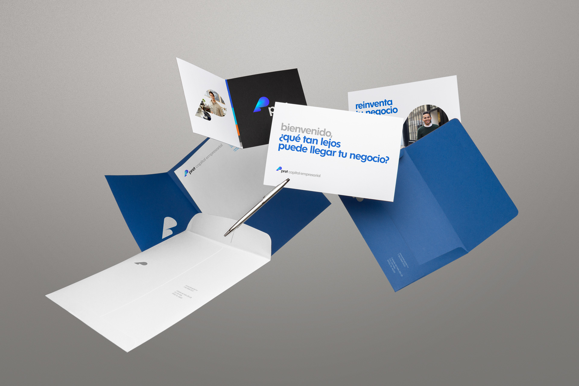
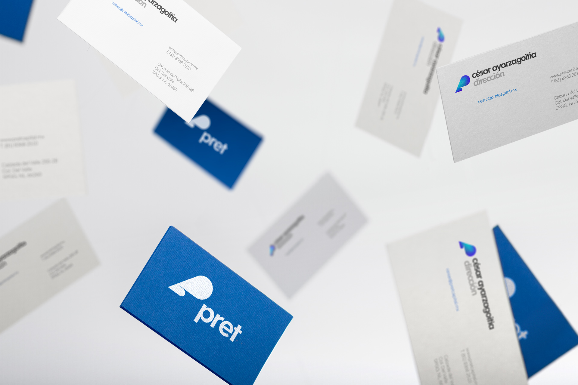
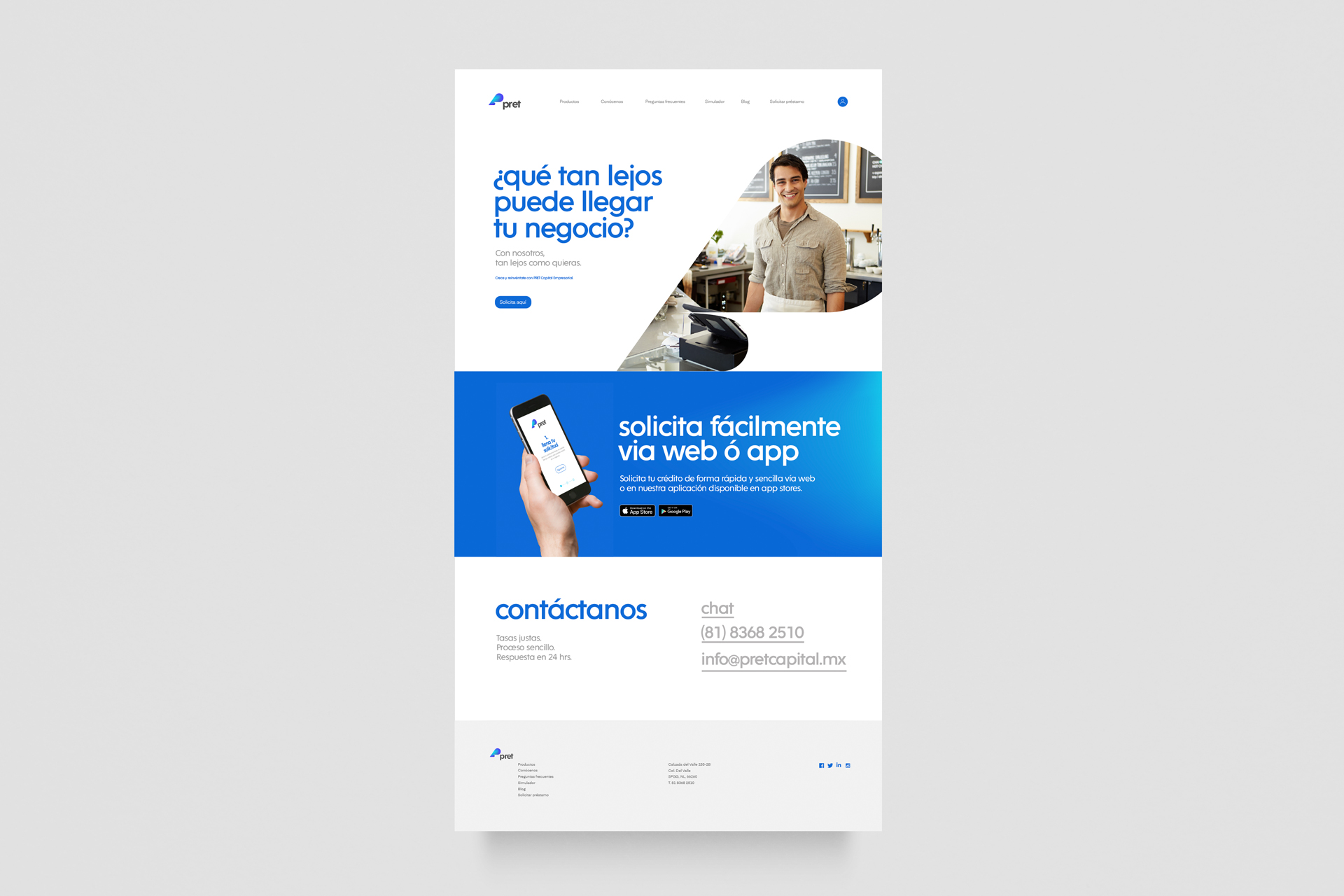
Pret is a financial institution located in San Pedro N.L., which focuses on loans for SMEs. The brand plans to offer its services online, in a swift and convenient fashion. The name comes from the French language. As an adjective, “pret” means ready, available, and convenient; as a noun means loan or credit.
Pret
Functional and effective financing can make a difference in the success of a small or medium business.
Pret looks to be at the forefront of this kind of service, achieving an outstanding level of assistance and communication with the clients.
Pret is a financial institution located in San Pedro N.L., which focuses on loans for SMEs. The brand plans to offer its services online, in a swift and convenient fashion. The name comes from the French language. As an adjective, “pret” means ready, available, and convenient; as a noun means loan or credit.
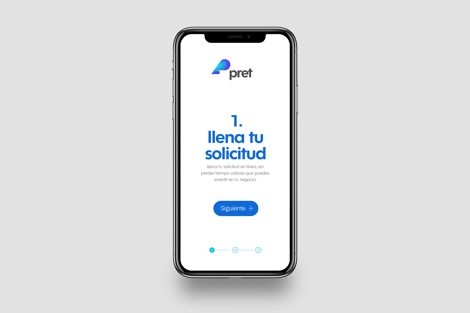
The pictogram that accompanies the logo is an abstraction of the letter “p”, presented with movement and a vibrant color palette. It was important that the brand transmitted reliability but approachability at the same time; that is why it was decided to use simple geometric shapes and immaculacy. Many of Pret's actions and services are concentrated in the digital realm, allowing the brand to experiment with gradients and varying colors.
◦ Corporative Branding
THE CHALLENGE
To enable Mexican entrepreneurs and startups to launch their business ventures through smart funding and venture capital.
THE OUTCOME
Naming, brand strategy, and design system that captures the spirit of passion and entrepreneurship for a consumer financial technology firm that empowers Mexican entrepreneurs and startups to embark on new projects and businesses.