Atlesia
Atlesia. A brand for athletes, built to elevate.
For a sports supplementation brand, every detail—from logo to online store—must communicate energy, purpose, and trust. Our proposal aimed to refine their visual and verbal identity while staying true to their existing essence.
The Challenge
Atlesia’s branding already had recognition and a strong presence. Our challenge was to explore subtle evolutions that could enhance clarity and alignment with the sports sector, while keeping the essence of what the brand already represented. This meant refining the visual style and messaging to feel sharper, more distinctive, and actionable, without losing the familiar face that customers knew.
The Outcome
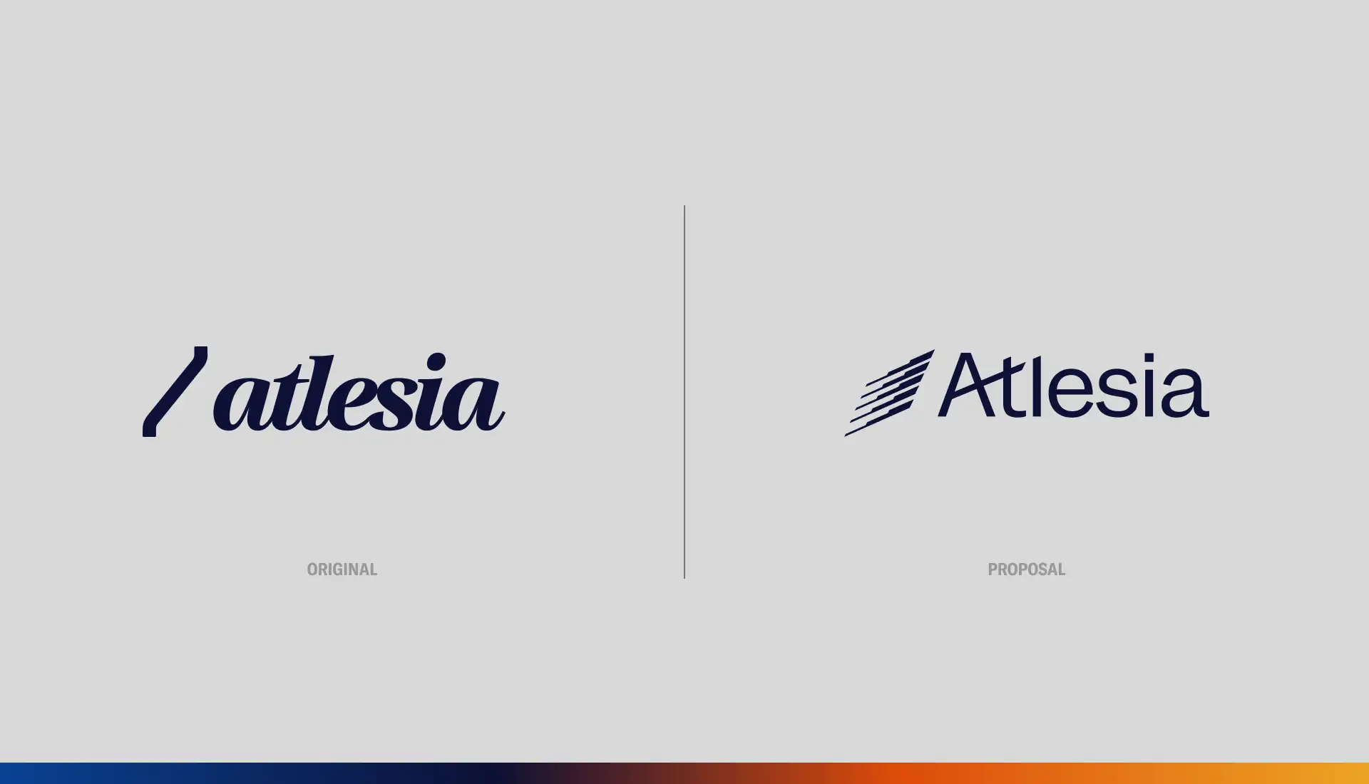
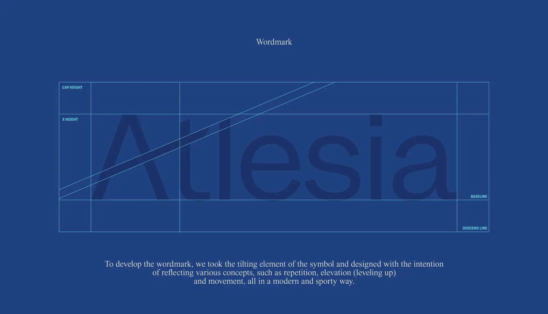
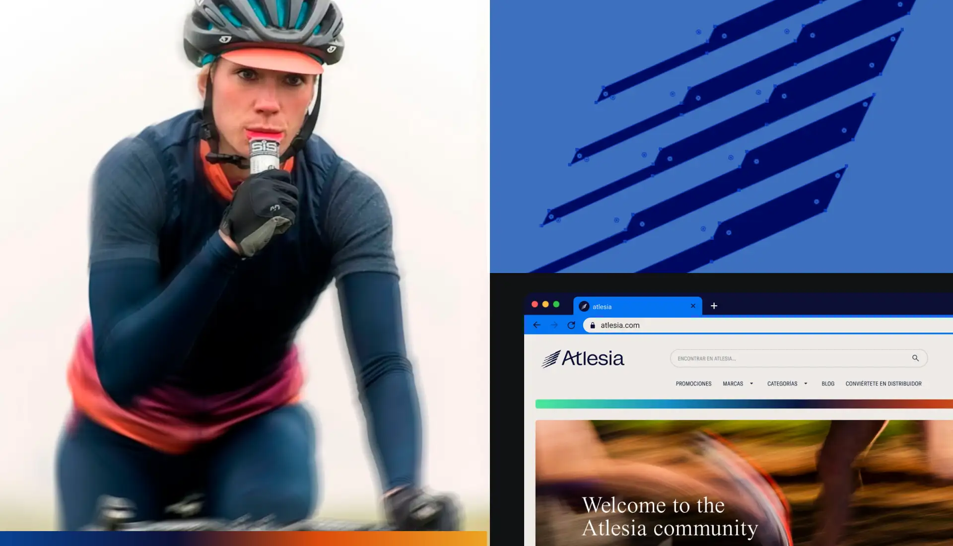
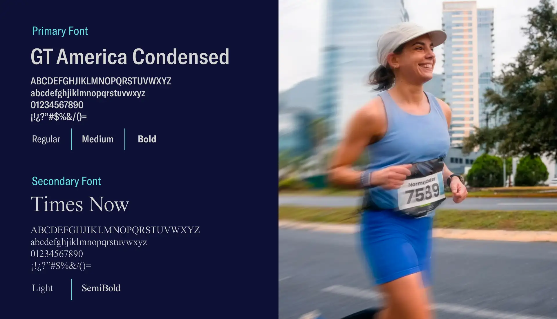
We proposed a refined visual and verbal identity that preserved Atlesia’s core character while emphasizing strength and performance. Visually, the logotype was slightly refreshed with a classic, legible typeface and a reimagined isotipo to convey movement and dynamism. Verbally, we introduced a secondary tagline, Este es el momento, adding positive urgency beneath the main slogan. The Shopify store was redesigned to reflect these updates in a cohesive, user-friendly, and motivating digital experience.
Services
Brand DNA
Brand world: A sports brand for action and results.
Atlesia exists to support athletes in reaching their peak performance. The brand embodies principles of strength, discipline, and consistent growth, offering supplements and nutrition solutions for people committed to their fitness journey. Our work focused on reinforcing these values in tone and visuals, presenting a brand that communicates motivation, energy, and reliability while staying approachable and familiar.
Brand identity: Science meets aspiration
The result: A cohesive identity that inspires every step of the journey.
This proposal envisioned Atlesia with a clear and motivating presence.
The refreshed visual and verbal identity conveys energy, clarity, and purpose, creating a brand experience—reflected in the proposed website—that feels inspiring and engaging for athletes.


