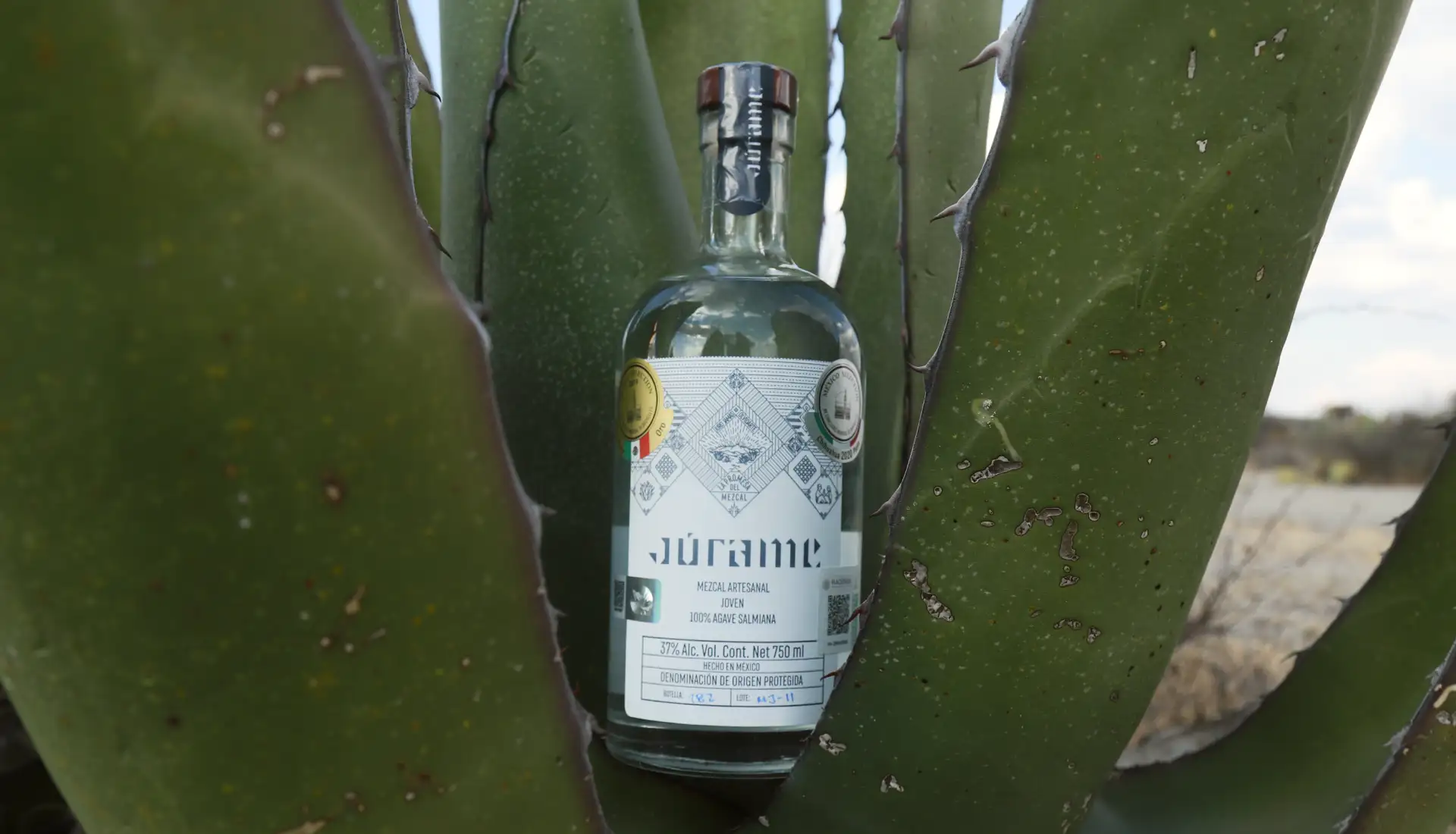
Júrame
THE SPIRIT OF A PEOPLE
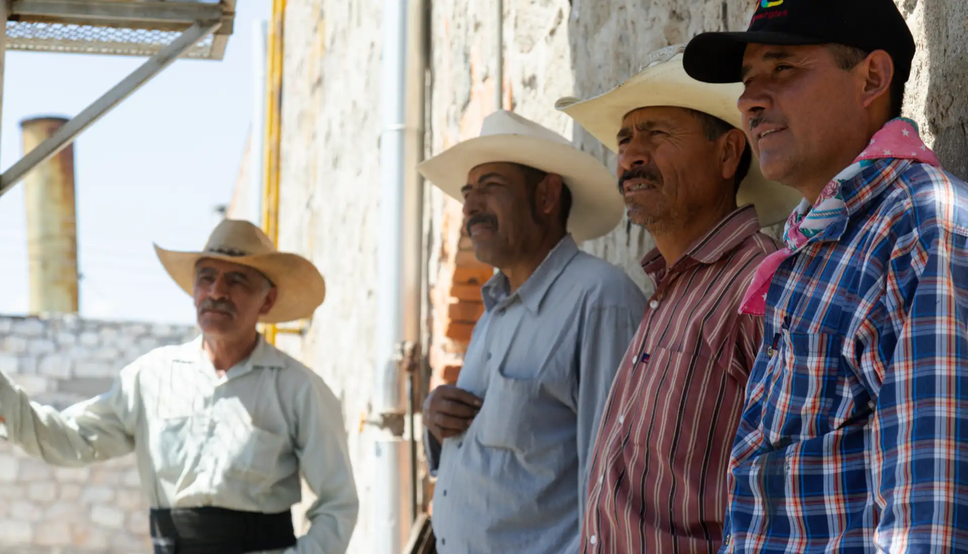
From a community that guards the ancestral knowledge of mezcal making is born a brand that is both authentic and functional.
The Challenge
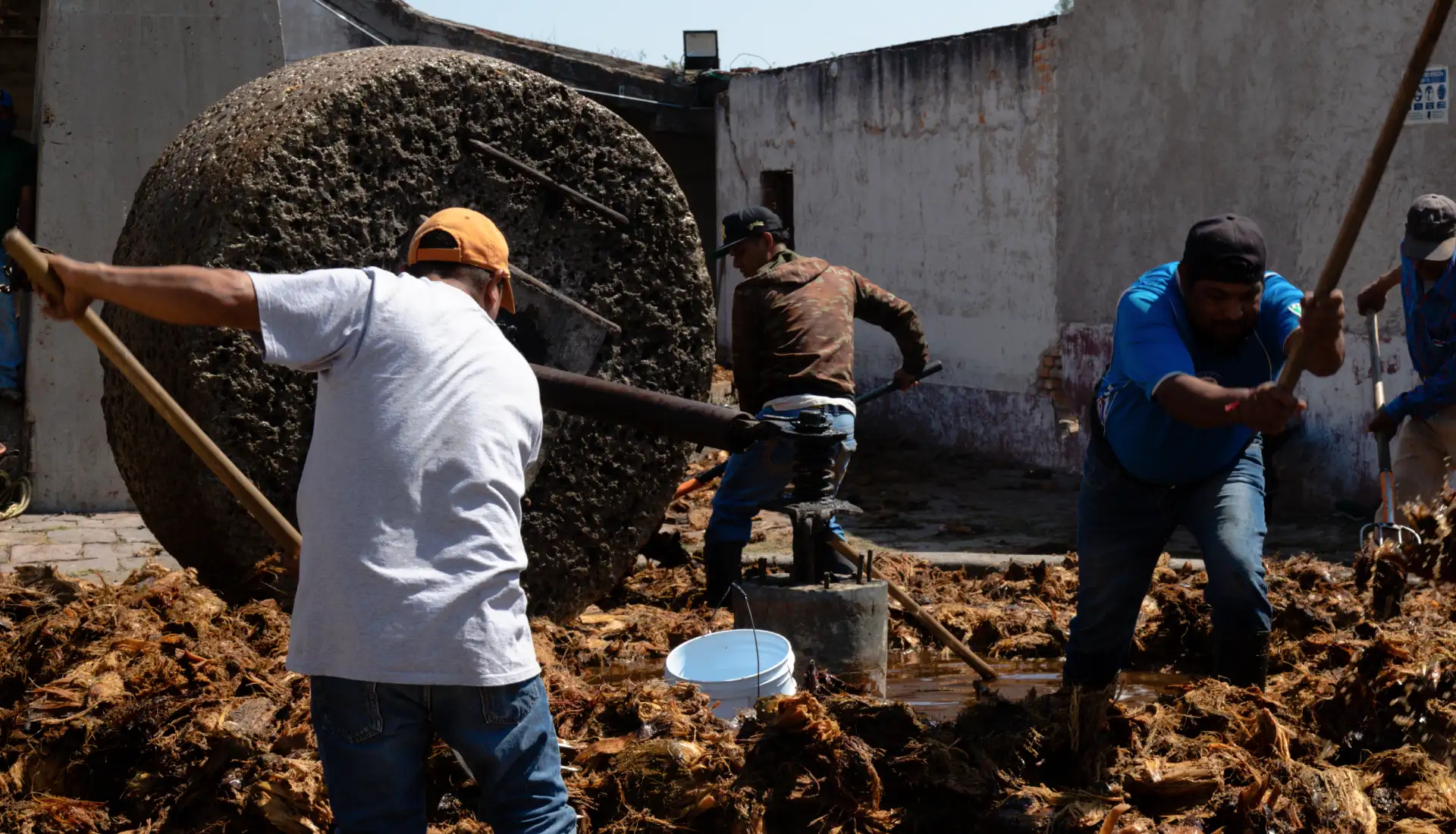
Creating a functional yet emotional brand that exalts Ahualulco natives hard word and gives a voice to one of Mexico’s national treasures.
The Outcome
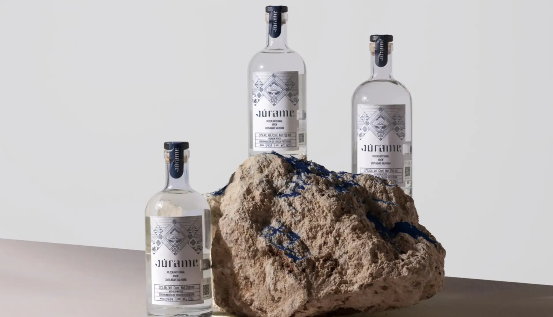
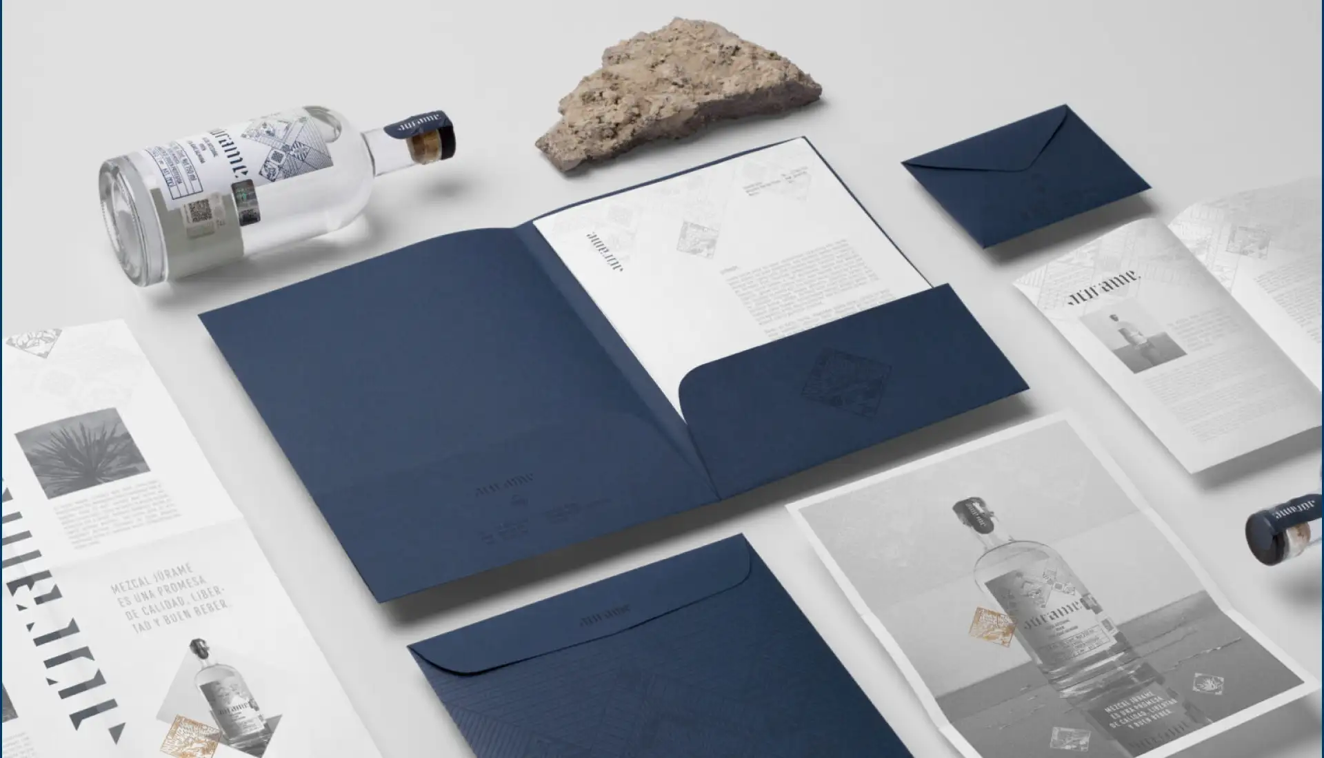
As a result of the project’s collaborative work, Mezcal Júrame was born: a brand that honors its people’s rich history and heritage that spans more than 100 years, but that is not afraid to look into the future.
Services
Brand strategy
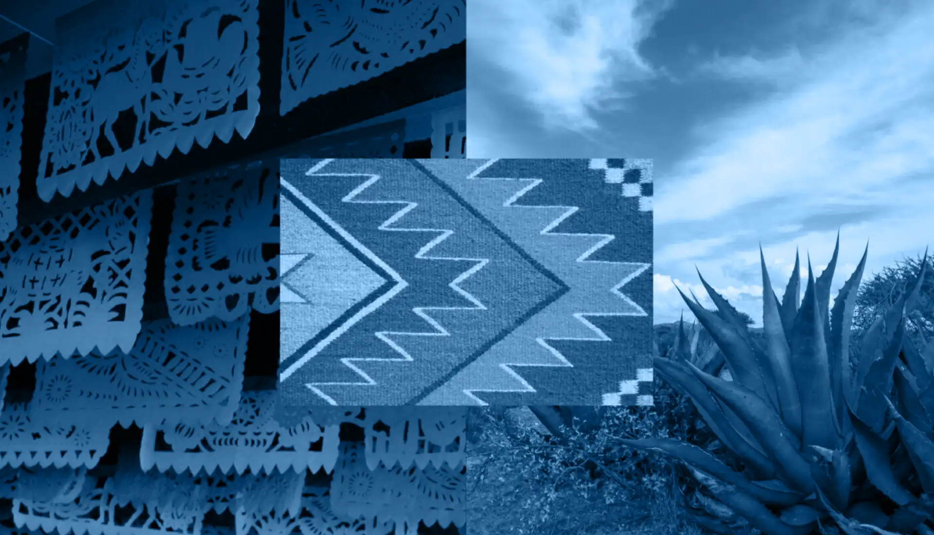
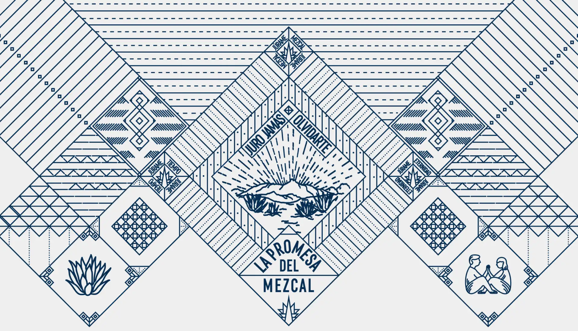
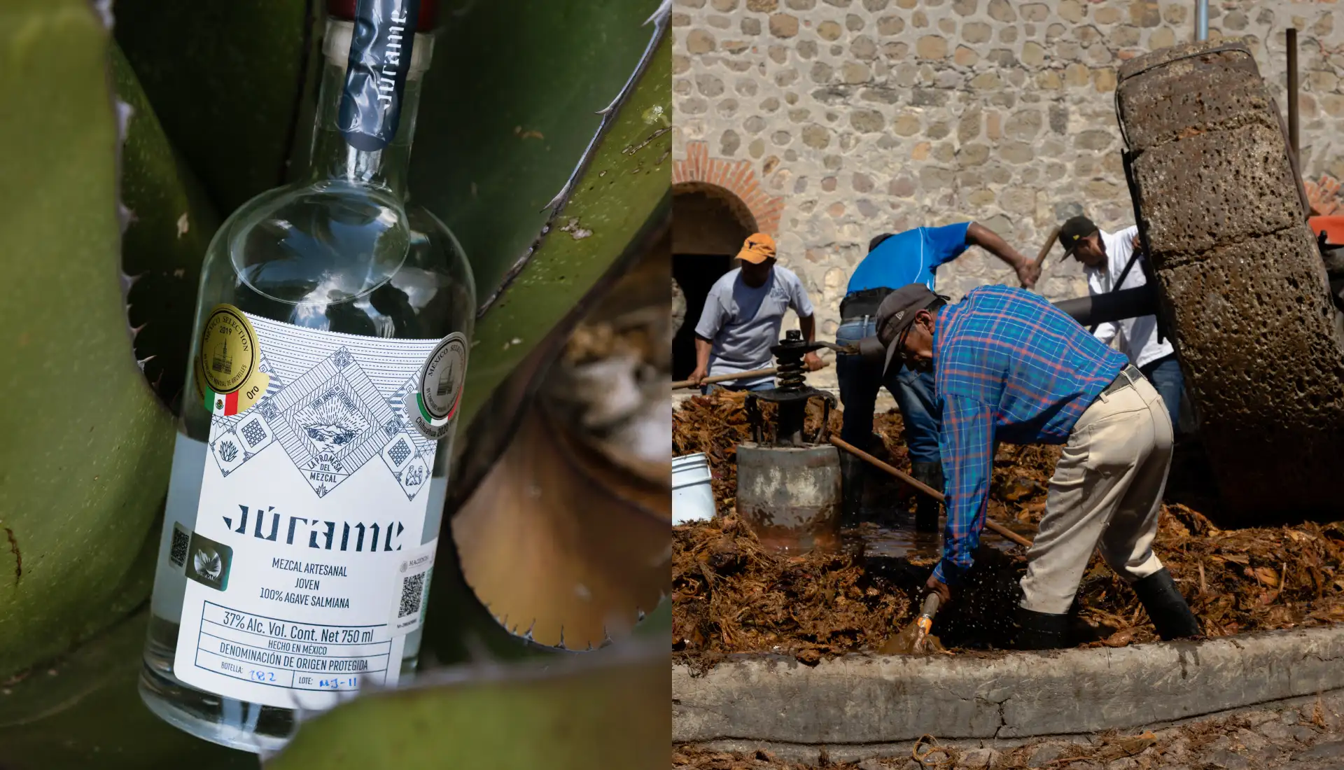
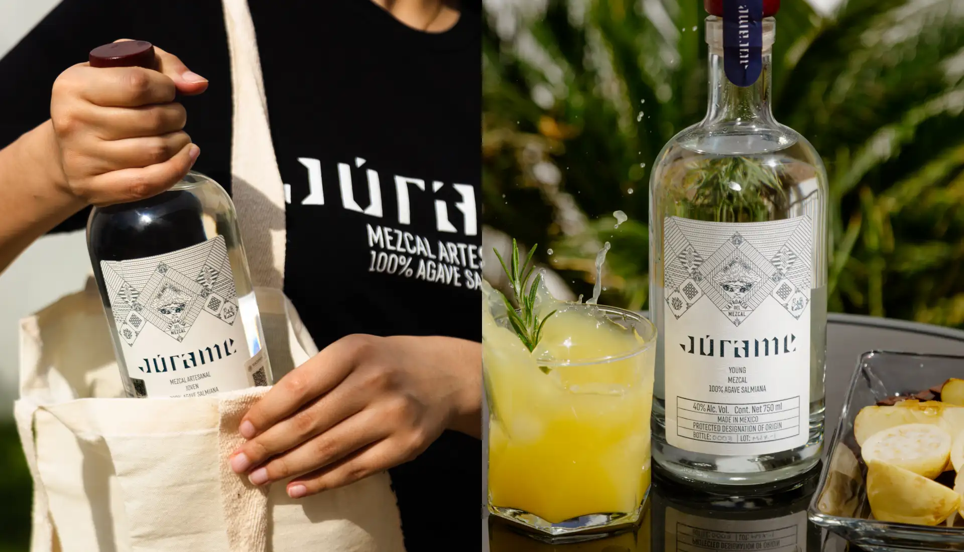
In the early 20th century, after the storm of the Mexican revolution, papel picado was becoming a popular craft, art deco buildings were popping up across the country, and the music of Maria Grever delighted listeners everywhere. It is one of her songs, Júrame, that is behind the name of this mezcal. The geometry of Mexican craftwork, the papel picado, and the elegant grace of art-deco buildings inspired the visual identity of this brand.
It was imperative to create a narrative that underlined the mexicanity of this mezcal, while at the same differentiating it from other mezcals, mostly from Oaxaca and other states in Mexico. This is why we used themes common to any Mexican’s identity for building this brand, while at the same time introducing graphic elements unique to this mezcal’s place of origin and to the people that make it.
The white of this crystalline mezcal and the deep blue of the Ipiña night sky are important elements in this brand. The blue represents profoundness, confidence, loyalty, and wisdom. While the white represents the beauty of mezcal, the purity that can only be found in a bottle of Júrame. The miracle of mezcal, which predates us and will survive us, finds a home in this bottle, with this visual identity that communicates the eternal character of Mexican culture.


