Clients ←

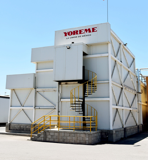
YOREME

WHERE CRAFT AND FAMILY TRADITION MEET.

Grupo Yoreme® is a family business with outstanding importance in the Northwest region of Mexico. Together we developed their visual image and brand strategy.

The Challenge

To rebrand Yoreme's classic and traditional image and communication focused on poultry to reach a larger audience and position them as premium Sonoran quality beef producers.

The Outcome

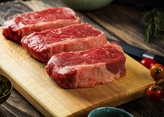
As a result, we changed the brand’s operating system (verbal identity, visual identity, logotype, brand behavior, packaging, and website) to communicate that Yoreme is a world-class leader in the beef industry. Thanks to this new image we communicate a clear message: Yoreme is the best premium beef brand in Mexico. “Yoreme, la carne de México”

BRAND WORLD: KEY INSIGHTS

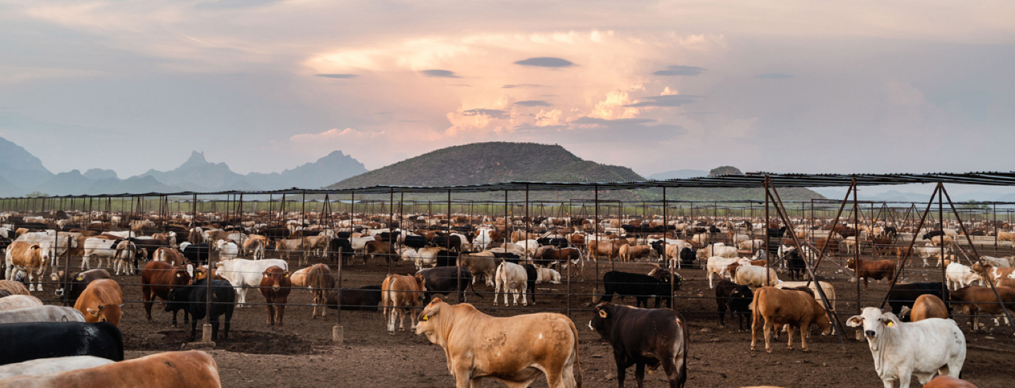
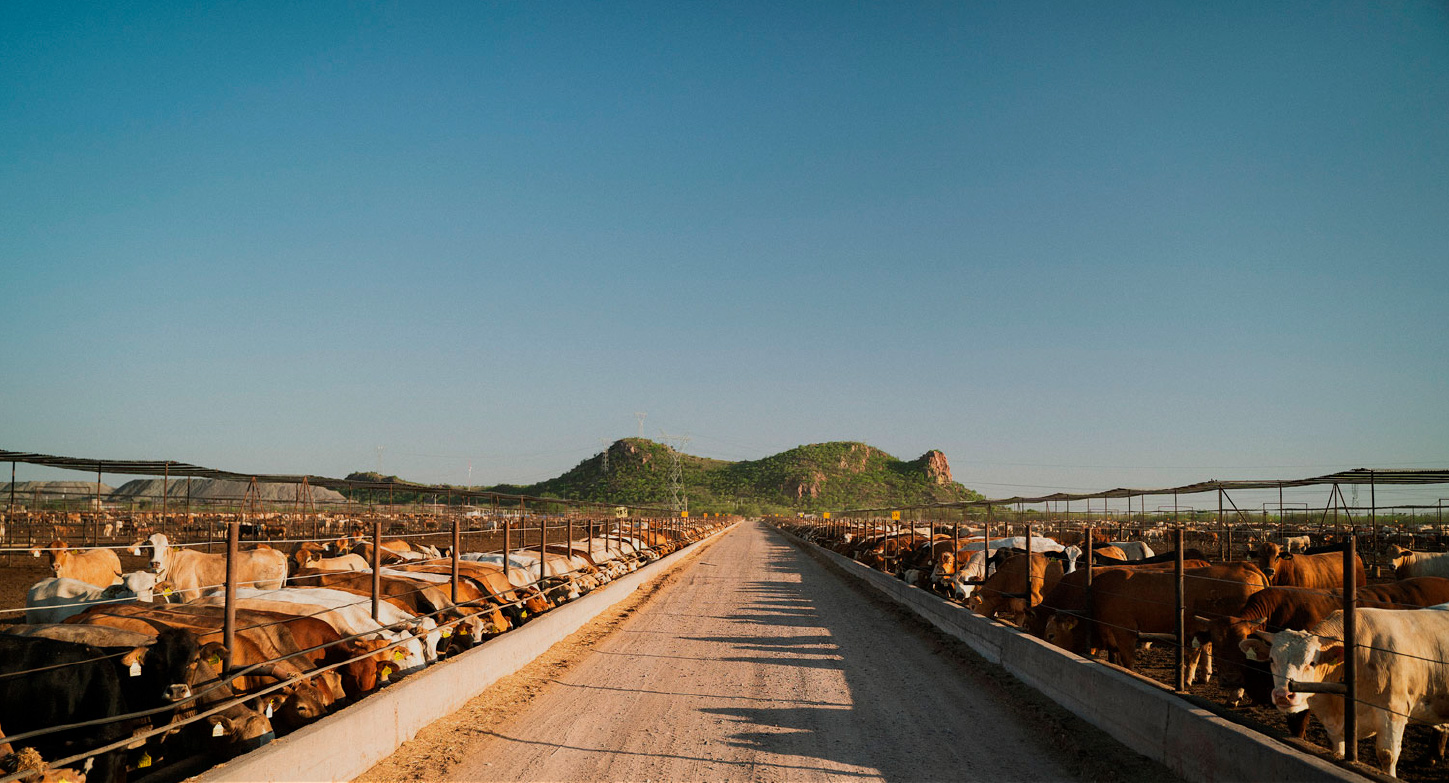
1 — Sonoran quality. Our cattle receive premium care at each stage of their process: balanced diets by nutritionists during their development and growth.

2 — Balance between tradition and modernity. A new identity that reflects Yoreme’s experience 75 year + of experience and adaptability to new markets.

WHO IS YOREME?

Grupo Yoreme focuses on producing food of the highest quality with sustainable practices and strict quality control. They produce beef, pork poultry, eggs and added value products from their Yaqui valley farm to tables in Mexico and worldwide.

For more than 15 years, they have ventured into exporting pork and beef to Japan, Korea, China, and Russia with the aim of reaching the United States in the future.

WHY YOREME?
Experience, leadership, and prestige are the characteristics that make this brand stand out in the meat industry. Yoreme's dedication and effort into food production result in the premium quality and distinctive taste of their products

CREATIVE CONCEPT:

In the 16th century, the first missionaries arrived in Sonoran territory along with their cattle, which soon proliferated throughout the region. They realized that the climate and soil were ideal for raising cattle. The rest is history.

Today, with more than four centuries of livestock experience, we are the quality reference in the country and the world.

Today, Yoreme is the most important meat producer in the region.

Yoreme is sharing a privilege.
Yoreme is national pride.
Yoreme is la carne de Mexico.

KEY MESSAGES

For the brand narrative, we focused Yoreme's communication on three creative concepts.

1. First quality. Our place is on the top shelf.
2. Sonoran pride.The ideal conditions for an extraordinary product.
3. Historical prestige. Centuries of cattle experience.

BRAND VISUAL IDENTITY

We choose to give Yoreme’s visual identity a new take. From the traditional design, we took its strength and contrast between typography. This fresh design reflects solidarity, experience, and consistency while transmitting a sense of balance thanks to the thickness of the bespoke typography on the logotype.

The choice of the new color palette reflects transcendence, the colors of the Yaqui Valley fields and farms, and Mexican culture. We aimed to place Yoreme as a the top-of-mind choice in the meat category, and this new identity design helps transmit that message.

For the design of the quality seal, we made sure to embrace the identity of the logotype on a smaller scale. We included "Garantía Yoreme" a brand promise in the design with the objective of transmitting a sense of quality and experience.

WEB DESIGN & DEVELOPMENT

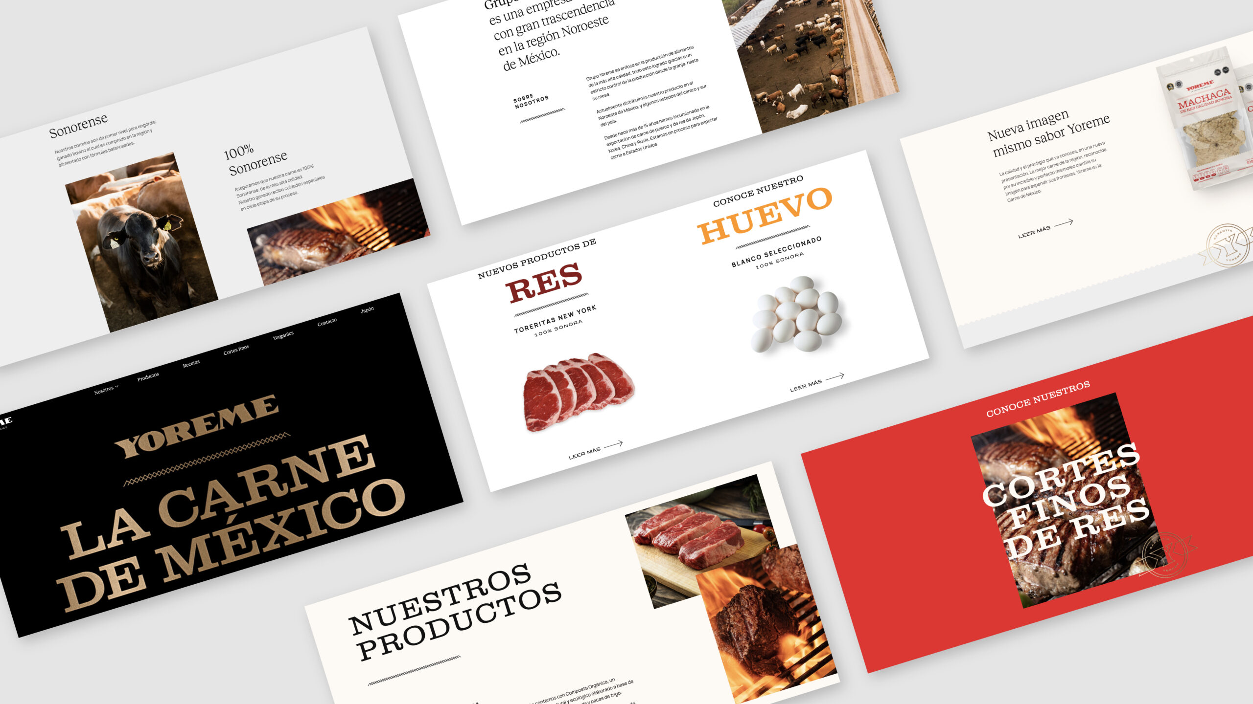
The website for Yoreme focuses on getting the audience to experience their brand in a digital format. This landing page introduces you to Sonora's best meat while showing its main products. This brand makes a statement: This is the best meat in Mexico.

Yoreme invites you to discover their different categories, production process, and broad international experience while communicating their main goals and vision.